The Use of Color Box Gift Packaging Color
In addition to the style and material, the individual style of color box gift packaging also has its own color matching. Good equipment must be beautiful in all aspects. The color skills of color box gift packaging design should be paid attention to the following points: First, color and packaging The anaphoric relationship between objects; the second is the contrast relationship between color and color itself. These two points are the key to the use of color, and the following is an introduction to this aspect.
1. Color box gift packaging color response
So how should the color gift boxes packaging be used as the relationship between color and packaging? It is mainly through the external packaging colors that can reveal or reflect the internal packaging items. When people see the outer packaging, they can basically perceive or associate what the inner packaging is. The author has mentioned this issue many times in the past articles, but if we can walk into the store and take a look on the shelves, many products do not reflect this kind of caring relationship. So that consumers can not think from the outside to the inside of what the packaged items are. Of course, it will not play a positive role in promoting product sales. The color of the normal external packaging should be to different degrees to grasp different characteristics.
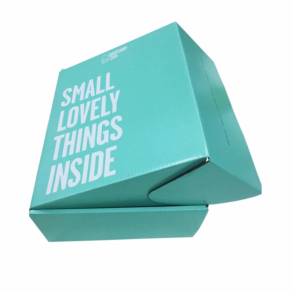
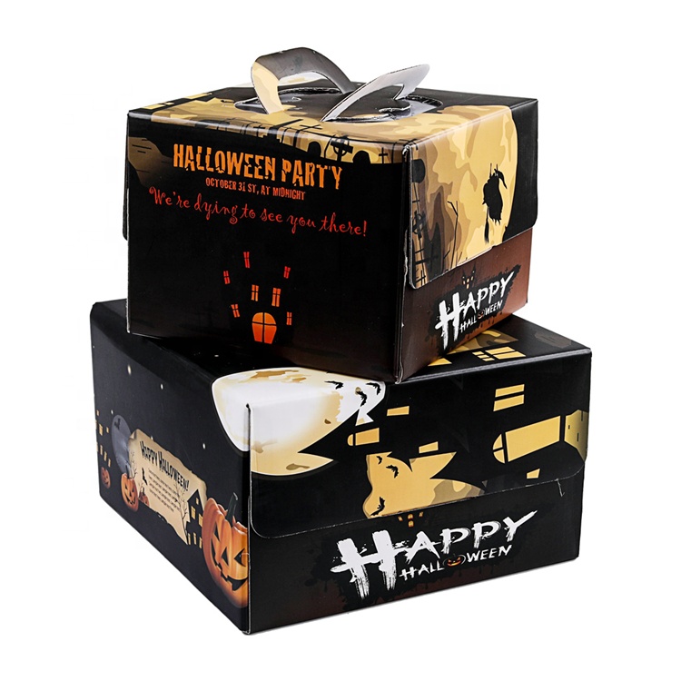
In terms of performance characteristics, as far as food is concerned, cakes and desserts are mostly made of gold and light yellow to give people a fragrant impression; beverages such as tea and beer are mostly red or green, symbolizing the richness and aroma of tea; tomato juice, apple juice is mostly red, which concentrates on the natural properties of the item. Although some packages do not look like the colors mentioned above in terms of the main color, if the design of the package is from the professionals, there are symbolic color blocks, color points, color lines or prominently concentrated content in the color box gift packaging. Some clothing boxes and cosmetic boxes, and even some wine packaging can find such examples.
2. Color contrast of color box gift packaging
Besides, the contrast between color and color is something that is easy to express but very difficult to grasp in many color box gift packaging. In packaging design, this contrasting relationship is very obvious and very common. The so-called contrasts generally have the following contrasts: that is, the contrast between the shades of color used, the light and heavy contrast of color use, the point-to-point contrast of color use, the simple and complex contrast of color use, the elegant and vulgar contrast of color use, and the contrast of color use.
More Article